Airport Series: Denver International Airport and the Illuminati

Next up in our airport analysis series: Denver International Airport (DIA) in Denver, Colorado.

In our ongoing analyses of airports and the reviews people leave about them on social media, we’ve showcased how natural language processing machine learning can give insights to stakeholders about what people like and don’t like about their airports. As I’ve written before, there is a difference between social listening and social “hearing.” The latter means that you can essentially “hear” the noise of natural language online, and the former means that you’re able to take what’s said and determine what’s important and what isn’t.

Denver International Airport: A Hub for the Illuminati?

Denver International Airport is the subject of a robust online conversation. Much of this discussion is relevant to airport stakeholders. For example, many conversations show how the airport is held accountable for the actions of individual airlines. Meanwhile, much of the chatter on Denver International Airport’s Facebook page is dedicated to the idea that DIA is a global haven for the Illuminati.

Yup. Now, for those not familiar, The Illuminati is a conspiracy theory obsession in some internet circles. Numerous blogs, subreddits, and YouTube channels claim this supposed shadowy organization of people are “really in control” of the world.

It all started in 2002 when former wrestler (and Governor of Minnesota) Jesse Ventura profiled the airport on his conspiracy theories television show. Though, perhaps, it’s best we let one of the reviewers explain this:

“It is actually an underground Illuminati headquarters. The enormous, hideous blue horse statue with glowing red eyes next to the entrance road killed it’s [sic.] sculptor before he finished it. The runway layout looks like a swastika when seen from space. There is a mural in one terminal that shows a child in a coffin. There are gargoyles on the inside of the building.”

Figure 1: Blucifer

Or as another person actually put it:

“Dude you’re [the] freaking Illuminati dude! what the truck [sic], there’s a trucking [sic] Blucifer statue dude! BLUCIFER!”

Blucifer refers to the statue of a bucking blue bronco in front of the airport. Some other travelers ironically engage in the fun. One comment praised Denver International Airport, claiming that — despite their connection with the Illuminati, occult symbolism, and “secret underground lizard caves” — it’s actually a good airport.

“I practically live here… one of the better airports… tons of secret passageways, [it] even has an antigravity bathroom feature…I recommend using that,” says another playful reviewer.

Context is key

Taken at face value, Denver International Airport is pretty well-liked overall, despite it being a secret world-controlling lair. Looked at in aggregate, the illuminati and Blucifer comments are marginal. The irony and sarcasm present in most natural language data sets can trip up most text mining tools, skewing results. But when the analysis accounts for context, real insights start to emerge.

General comments about airport staff are positive by a two-to-one ratio. The number of positive comments about the attitude of airline employees is also mentioned more positively than negatively. Themes like the security line, bathroom cleanliness, a lack of hooks on bathroom stalls, and an inefficient baggage claim do carry negative sentiment, at a ratio of six to one. These insights, which account for 35% of Denver International Airport’s Facebook dataset, are the nuggets of gold hidden in them there hills (of data). The knowledge provides actual business insights for airport decision makers. This is the sort of precision you can expect when you have an easily tunable sentiment analysis solution.

Getting it right

One commonality between all conspiracy theorists is their cherry-picking evidence to support a premise. This faulty logic has no place in business, let alone an airport. Yet, when leadership at Denver International (or elsewhere) turns a blind eye to social feedback they’ll inevitably fall prey to the same confirmation bias. As the ACRP says, “Airports do not have a choice about whether to be involved in social media; the question is how well they do it.” When airports use solutions like those provided in the Lexalytics product platform, they’re guaranteed accurate and meaningful social listening insights with minimal effort.

And as for the Illuminati? Nos autem videbo vos ad aeroportus!

Airport Series: Dallas/Fort Worth and The Dirty Secret

Today we’re continuing our ongoing analysis of Facebook reviews for the busiest airports in America. Next up is Dallas/Fort Worth International Airport (DFW) in The Lone Star State, Texas.

Interestingly, DFW was named both the best and worst airport in 2017. What’s more, the results of our sentiment analysis were mostly neutral. These two facts suggest that DFW is simply not an airport customers are particularly passionate about. But, as we’ll see, when Dallas/Fort Worth falls down, it falls down hard. Addressing these foibles could directly improve DFW’s revenue.

Dallas/Fort Worth has cleanliness problems

Dallas/Fort Worth’s Facebook reviews comprise of 88,163 words, split into 2,249 comments. 7% of these pertain to cleanliness. Comments about “gross stains,” “sewage smells,” “human excrement,” cries to “CLEAN UP!” (and worse) permeate the data set. “I was embarrassed to be an American in an American airport.” said one reviewer, returning from a vacation in Mexico.”Gray, dingy, dirty, old…an embarrassment…” echoed another. “I have traveled outside our country, in third world airports even, and they were cleaner then [sic] this airport.”

Remember, airports depend on non-aeronautical revenue. This means they depend on the dollars travelers spend while in the airport. Thus, maintaining facilities to attract consumers is key.

DFW is flailing here. As one woman pointed out, “The ladies bathroom by gate 12 was disgusting, there was pee everywhere…  If I can avoid your airport in the future, I will!”

In fact, our data set is replete with similar examples.

“This airport is one of the dirtiest I have passed through,” one said, then continued, “The bathrooms always smell of urine and the seating has crumbs and spills… I will avoid going through this airport in the future.”

Many more flyers swore off DFW after citing its cleanliness.

“Carpet was so dirty your feet stuck to it. Also family restroom was dirty. The terminal was very old and is in need of updating. If I return to Dallas, I will probably try and fly into a different airport.“

Customer experience is key to airport success

The Airport Cooperative Research Program (ACRP) has repeatedly cited customer experience management as key to the success of modern airports. As they point out in their latest report, “Ad hoc brands are formed over time by the many associations customers have made with an airport. These associations shape the customers’ expectations and perceptions of the services, products, and encounters that they expect at the airport and become the airport’s de facto promise. Actual customer experiences, reports in traditional and social media, and hearsay all contribute to these associations, in good ways and bad.” The ACRP continues, “Airports do not have a choice about whether to be involved in social media; the question is how well they do it.”

The ACRP operates under the Transportation Research Board (TRB), itself a division of the National Research Council. These organizations serve to not just benefit the traveler, but also the organizations they support. So, it’s with no uncertain weight that the ACRP dedicates an entire section of their Report to airport cleanliness. “A statistical study of the drivers of airport satisfaction and dissatisfaction based on a content analysis of 1,095 traveler comments on an airport review website concluded that key drivers of customer satisfaction included terminal cleanliness and a pleasant environment.”

What’s worse than a dirty airport? Waiting in one

Now we understand the gravity of facility cleanliness, it merits asking “what could be worse than a dirty airport?” According to travelers, being stuck in one is even worse. 18% of DFW’s Facebook reviews pertain to waiting: waiting for food, waiting for the bathroom, waiting for the shuttle, and – worst of all – waiting for baggage.

While waiting might seem an endurable irritation, the consequences can be meaningful.

“My 80 year old Grandma had to withstand endless hours of waiting in lines that curved around halls…”

Another reviewer was not as patient:

“You won’t be receiving my money again and I will make sure everyone I know knows that you have raised your rates and decided to cut the amount of buses you have in half. There were families waiting with little babies in the heat while we watched many other buses go by that could have easily been re-routed.”

What should Dallas/Fort Worth do?

Addressing cleanliness and the other factors holding customers back is a simple way to protect the DFW brand. A look into the most positive comments offer a suggestion about how airports can salvage the customer experience for inconvenienced travelers. Individual interactions with staff can make all the difference. While it’s not yet appropriate to call this a trend, it’s a theme we’ve recognized in every airport dataset we’ve analyzed.

Customers take notice of how they’re treated by staff, whether they go online and write about it or not. Employees who are curt, disinterested, or impatient exacerbate already stressful situations. The negative sentiment associated with an unavoidable mishap, like a delay or layover, can be alleviated by a positive staff interaction. This not only helps the customer, it also shores up brand loyalty. As one DFW reviewer laconically puts it, “Friendly and helpful staff at airport… Definitely will return.”

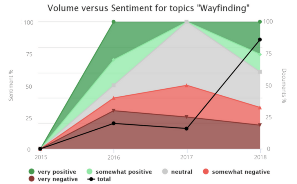
Airport Series: Chicago And Viral Reputation Management

As we continue our ongoing analysis of airport reviews, we come to Chicago O’Hare International Airport. The story of Chicago’s airport is a study in how not to manage your reputation in the face of a viral public relations disaster.

Chicago O’Hare and viral reputation management

On April 9, a video of Dr. David Dao being violently dragged from a United Airlines flight went viral and made national news. Eventually, two municipal aviation officers were fired. United Airlines wasn’t fined, but they did take a major public relations hit. I’ve already written about public reaction from a high-level viewpoint. But when looked at more closely, O’Hare’s proximity to the incident is a study in viral reputation management.

 It’s important to emphasize that I only looked at Facebook reviews for this Semantria analysis. This doesn’t account for YouTube comments or Tweets. Regardless, if you took all of O’Hare’s Facebook reviews that mention Dr. Dao’s removal line by line, and bound them in a paperback book, you’d end up with an 18-page novella of fury. Responses to that one event account for 6% of Chicago O’Hare’s entire Facebook review volume for the past year. And believe me, it’s a passionate 6%.

“I think after watching videos of [people] getting dragged off planes at your airport…I pray you go BANKRUPT!!!” wrote one angry user.

Said another:

“I’m not flying through anywhere that condones its airport police staff assaulting a flyer…. I’ll avoid it completely. I understand you suspended one of these highly trained officers, my question is why haven’t you fired him!”

Figure 1: O’Hare’s overall sentiment breakdown

A full 20% of these comments urge potential customers to eschew O’Hare in favor its chief competitor, Midway. Further still, some social media users recommend routing layovers through an entirely different state. “Use Mitchell Airport in Milwaukee (MKE). No Beatings at Mitchell,” one user wrote, adding that people who wanted to “avoid assaults” should go there. What we see from our analysis is just how far from “engaged” and “contented” O’Hare’s guests are.

Responding with Analytics

By using a natural language processing solution to monitor their social media, Chicago O’Hare might’ve gotten ahead of the public vitriol with a proactive, rapid-response PR blitz. (Incidentally, there’s only one other complaint of equal volume on Chicago O’Hare’s Facebook reviews: WiFi.  O’Hare only offers 30 minutes of free WiFi. As one tourist from Italy put it:

“Only 30 min free wifi! Not enough for USA concept of freedom.”

But instead, they were put on the back foot and forced into taking reactionary measures.

Figure 2: The chasm between Facebook star ratings, represented here by O’Hare ATC Towers, illustrates a fractured opinion of the airport.

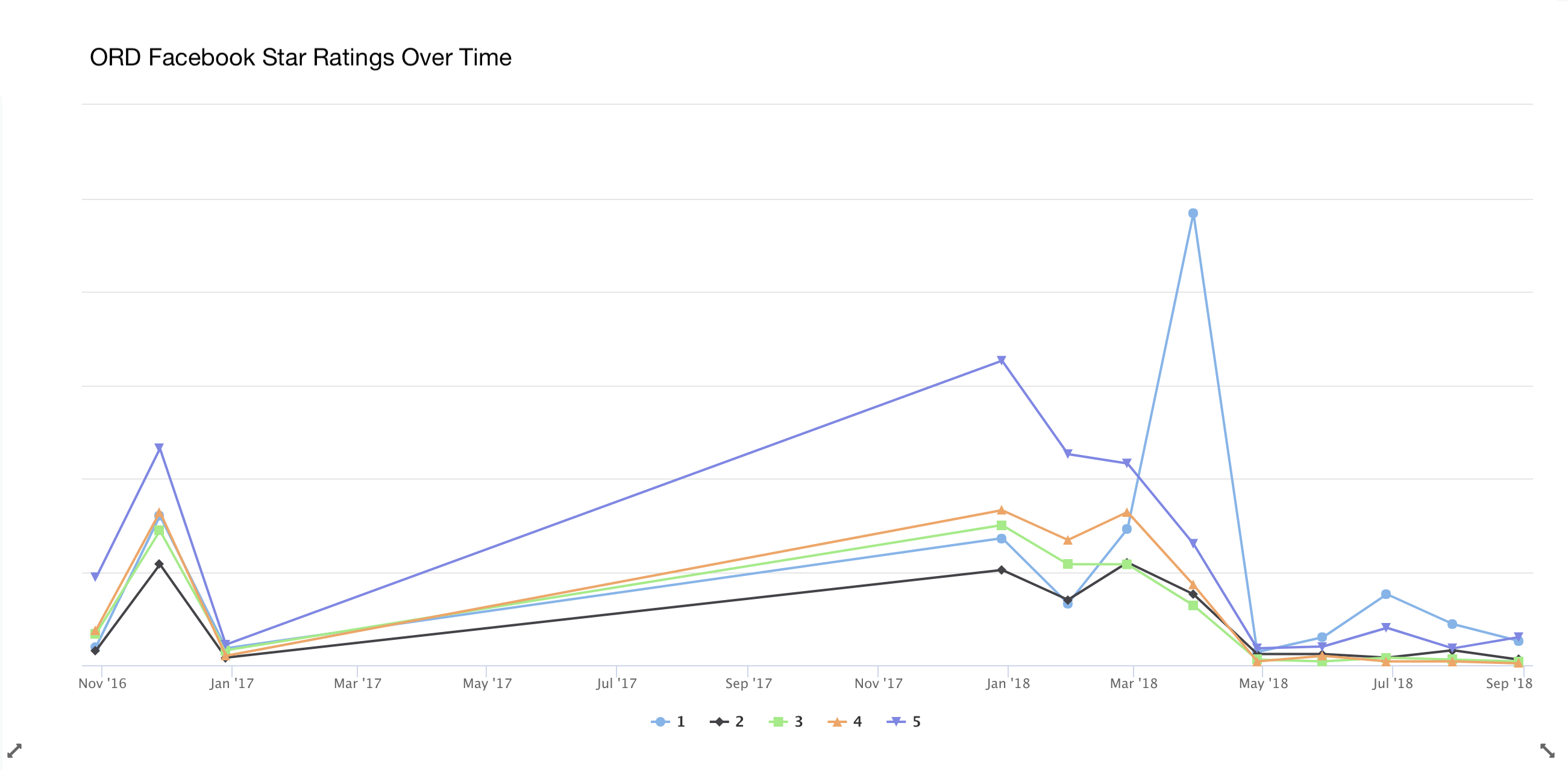
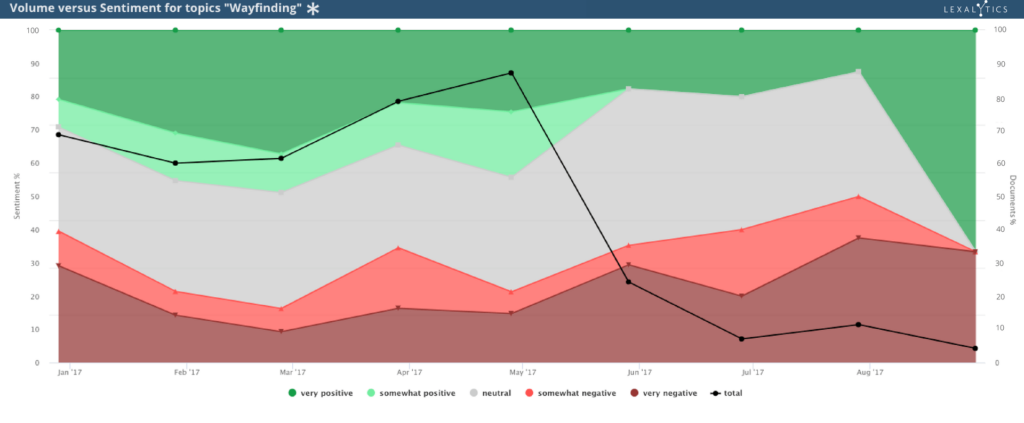
In fact, we can see the topic trending through April using Lexalytics’, an InMoment company, web dashboard, Semantria Storage & Visualization. Occurrences of Facebook ratings with 1 star within the data set jump from 11% to 58% in a matter of days. Meanwhile, reviews with a 5 star rating halve from 37% to less than 15% overnight. ORD’s negative social conversation dominates its Facebook feed for months later, with 1 star reviews maintaining a 2:1 ratio over 5 star reviews until August 2018.

Using Semantria Storage & Visualization, it’s easy to observe the negative trend hitting ORD’s brand.

Guilty by brand association

Why is this relevant? Even though Dr. Dao’s removal isn’t Chicago O’Hare’s fault, it still casts a pall over their brand. In the words of the legendary advertising firm Ogilvy, “a brand is guilty by association.” What’s more, the public is not a court, and its judgement is often unequivocal and uncompromising. Addressing this judgement head-on is often the only way to mitigate it.

Considering how the internet played the role of catalyst in this PR crisis, O’Hare might’ve used the opportunity to debut free WiFi in its facilities. They could’ve positioned it as a strategy to empower guest feedback at all times. Connections like this can open up a line of communication between the brand and the customer, potentially easing tensions. In this example, enabling free WiFi speaks to two public concerns at once.

“…O’Hare’s proximity to the incident is a study in viral reputation management.”

Figure 3: 122 comments specifically referenced WiFi. None of the mentions were positive.

Chicago O’Hare needs text analytics

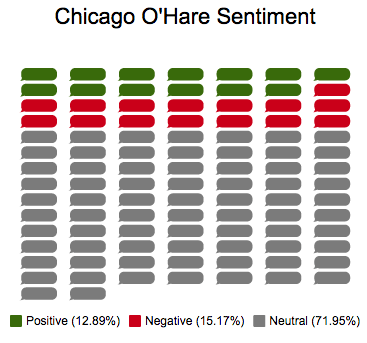
It turns out Chicago O’Hare didn’t take any dramatic steps to curtail public outcry. This could turn out to be a folly that comes back to haunt them. As it stands, airports play in a high-risk space where profit is lean at best. In fact, 70% of airports lose money. As regulations and other burdens pile up, airports like O’Hare need to depend less on aeronautical revenue and more on non-aeronautical revenue, such as retail developments, office developments, and lifestyle developments—like WiFi. However, non-aeronautical revenue is contingent upon engaged and contented customers. What we see from our analysis is just how far from “engaged” and “contented” O’Hare’s guests are.

A whopping 87% of O’Hare’s Facebook reviews from 2017 bear sentiment weight somewhere between negative and neutral. That’s a grim place for any brand. But it’s not a total loss; a simple application of tools like text analytics can solve reputation woes like O’Hare’s affordably and effectively. These are technological solutions that can’t be neglected. When it comes to an asset-intensive business like the modern airport, text analytics is as vital as new terminals, aprons, and runways.
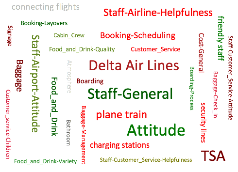
Airport Series: Charlotte and Customer Complaints

More than 40 million people travel through North Carolina’s Charlotte Douglas International Airport each year, and it remains one of the most consistently least-liked airports. Today, we find out why.

Charlotte Douglas should invest in ADA training

An overview of our analysis indicates that this airport in part suffers because of specific airlines and their employees, weather delays, and a few other things they realistically have no control over. Still, there are plenty of areas where the airport could take steps to improve the customer experience. All they have to do is start listening to their customers.

Charlotte Douglas is compliant with guidelines required by the Americans with Disabilities Act, but some of the most vociferous complaints came from people with disabilities or their family. One woman said she and her traveling partner, a disabled veteran, were left “high and dry” at the gate. Another reviewer reveals that her daughter, who suffers from spina bifida, was forced to walk to the parking area and denied access to a “vacant wheelchair” designated for public use.

With text analytics, airport officials could find the commonalities in these complaints and fix them for the future. These reviews suggest that Charlotte Douglas should invest in ADA training for their staff. They also need to better inform their guests about what accessibility options are available. Simpler still, increased signage highlighting the way for guests with disabilities would do much to alleviate some of these complaints.

Racial undertones at Charlotte Douglas

“Enjoyed the small quiet chapel and the piano player. Soothing amidst chaos,” one reviewer wrote. Another cited the rocking chairs and the piano as why Charlotte Douglas was “the most-relaxed airport” she’d ever visited. However, this veneer of southern charm is thin, especially when one considers the history of race relations in the American south.

The airport recently shut down their bathroom attendant program. The restroom tradition was controversial for many reasons, not least of which involved the former Confederate state’s history. Without diving into the socio-political issues at the heart of that debate, text analytics could have shown airport officials that people generally hated the service. A number of customers cited it as their “only complaint” about the airport. Still more comments from customers cited the presence of the attendant as off-putting.

Some didn’t appreciate that the attendants worked for tips, especially since they didn’t want the attendants’ help in the first place.

Others, however, did notice racist undertones to the bathroom attendant program. One reviewer, who advised travelers to avoid Charlotte-Douglas “at all costs,” merely pointed out that the attendants were black men every single time, letting the implication speak for itself. Another reviewer was more direct. “Bathroom attendants are tacky, especially when the bathroom is filthy. Would it not be a better use of time to clean said bathroom rather than perpetuate an antiquated form of southern privileged genteelism?” this person wrote. All of the comments typified a myopic and disconnected management style. Text analytics could have helped identify and eliminate this problem before it became a hot-button issue.

Attitude issues

This leads to what is clearly the biggest problem for Charlotte Douglas: the attitude of its staff and those working for airlines, rental companies, and in other airport fixtures. More than 800 reviews, or four out of every five we looked at, make some mention of customer service or airport staff. Only rarely were these mentions positive.

This is a major problem for any business, but especially for airports. If you look back to our Atlanta analysis, you’ll see that airport staff were often the saving grace for customers. When airline staff were overworked or simply rude, employees of the airport stepped in to assist in customer service. At Charlotte Douglas, this is not the case.

So, even though some airports don’t get a fair shake when it comes to flights being delayed because of weather or other extraneous circumstances, our analysis shows that airport staff could do more to alleviate their guests’ stress and frustration with just a minor shift in their attitude. Increased training for employees and signage aimed at working with guests who have special needs would also ease a pressing issue. Finally, more charming, restful areas like the rocking chairs and piano could take Charlotte from the bottom of everyone’s lists to the top.  

Listen and improve

The people who travel in and out of Charlotte Douglas International Airport every day are desperately telling officials how they can improve their service, in very detailed and colorful ways. By listening to these guests, officials can determine the best solutions to these problems. However, without text analytics, there is no effective way to hear them in the first place.

Airport Series: Atlanta and Wayfinding

So, here’s the thing: few people are happy when they’re in airports. Whether it’s for business or pleasure, packing everything, checking in, and running to make your flight are all experiences that are generally negative. At least, that’s how I feel when sprinting through indistinguishable terminals looking for my connecting flight – and Atlanta International Airport is no exception.

Figure 1: This combination word cloud displays the top themes, entities, and categories along with their overall sentiment for Atlanta International

There are no shortage of listicles and videos online “rating” airports from best to worst. Yet, what does that really mean? Here at InMoment we focus on data and methodology, and Semantria can answer this question by mining Facebook comments, online reviews, and other data from people’s first-hand experiences.

Sentiment analysis for Atlanta International Airport

For example, we processed more than 2,759 Facebook reviews for the Atlanta International Airport, clocking in at 5,000 more words than Pride and Prejudice. That’s a lot of reviews, and it allows for very clear themes to emerge. Airport leadership regularly balances budget between marketing and infrastructure, this is where text analytics comes in. Text analytics allows airport leadership to prioritize projects based on customer experience impact. As we’ll find out, often enhancing customer experience requires little overhead. Addressing feedback directly and communicating progress through legacy channels and social media connects customers to the brand by showing them the airport is listening. The product we used for this project is the web based dashboard, Spotlight.

Feedback for Atlanta: Wayfinding

What was the most frequently occurring feedback for Atlanta? Quite simply, wayfinding.“Wayfinding” refers to the way in which people orient themselves in a space to get from one place to the next. At the Atlanta Airport, customers rely on the Air Train to get from the gates to the baggage claim, which can be literally miles away from the gate. So, without clear signage for the train, guests are compelled to walk this distance. Wayfinding related feedback is so vociferous that in over several hundred reviews guests outright advise fliers to avoid Atlanta International Airport entirely. One season traveler shared feedback the following on the ATL Facebook page recently:

“Back when I was traveling a few hundred thousand air miles a year, I avoided this airport like a third world dirt airstrip. Twenty five years later it still has lousy signage, crazy long distances to walk and takes forever to go from point A to point B to say nothing of the crowds.”

When airport architecture is effective, getting from “point A to point B” should be snappy, despite size or crowds. Jim Harding of Gersham Smith & Partners helped design Atlanta’s International Terminal. He asserts that Hartsfield–Jackson is architected with intuitive design in mind:

“We have a set of visual cues that naturally lead and guide you through a big, open space. And it’s a big part of your journey segment… you have lighting that goes up, and over, and down; you have flooring that pulls you in and through. The two come together and point you to the plane that you see through the glass. So this design is very carefully thought out, making that customer experience easy, natural, fluid, intuitive.”

When contrasted next to the true customer experience, which here is represented as natural language data, we can see there’s a chasm between the architect’s intent and how it’s experienced. This is cause for alarm for the airport company, as a lost customer is less likely to have time to engage with third party vendors, impacting precious non-aeronautical revenue.

“It took entirely too long to get to my next gate. There was a mile walk without the train…. With knee problems, pain wasn’t suppose[d] to be a part of my plane ride,” one guest wrote.

Figure 2: Wayfinding over time. This represents volume and sentiment over time for a segment of the data set

Using sentiment analysis we can understand that spaces are too large and confusing. Jim Harding and his team no doubt delivered an admirable design. However, customers still find the spaces at Atlanta cavernous and unstructured enough to be overwhelming. Signage must increase throughout the facility. Customers complain of the less than intuitive design outside as well. Says one reviewer:

“Worst uber/Lyft pickup process ever and terrible signage. I walked alone in a parking lot for an hour before I found it.”

Another, this time a local, confronts one of the airport company’s richest sources of non-aeronautical revenue, parking:

“I’ve been living in Atlanta for 2yrs now. It is a bit confusing. The parking is horrific! Not enough signs for direction and the plane train was definitely anxiety because I didn’t know where the heck it was taking me.”

Saving grace: airport staff

Atlanta International Airport Theme Volume Versus NPS
Figure 3: Overall Theme Sentiment for the Atlanta Facebook dataset, compared against NPS scores pulled from Facebook’s star rating system

Yet, our analysis also revealed that airport staff can be the saving grace for unhappy customers. One guest pointed out that Delta airline staff were both rude and unhelpful. However, that guest was ultimately helped by an airport maintenance worker to, you guessed it, help find the way to the baggage claim. Another airport employee took a struggling guest to the baggage claim in a wheelchair. Yet another guest described how an airport employee named Timothy not only helped her to the baggage claim, but assisted her in securing a rental car after that company’s employees were “no help.”

Perhaps best of all is an an airport employee who brightens peoples’ spirits while they wait for the bags. As one guest wrote, “I’ve been through this Airport several times. No complaints. I must say I like the man downstairs by baggage claim. Always a song, story and always wanting to give information.” The person-to-person connections travelers make with these employees colors the entire narrative of their experience with the airline and the airport itself.

How Atlanta should act

These are details that stakeholders wouldn’t get from a star-rating or the possibly anecdotal experience of a journalist or reviewer. By simply improving signage and other wayfinding techniques, Atlanta can alleviate myriad pain points on the customer side. On the enterprise side, airport officials can effectively communicate expectations and feedback with their airline tenants, such as Delta and their unhelpful staff. This can build trust between stakeholders and the airlines, and improve the experience for everyone.

All this, just from listening to the customers in a way that allows airports to really hear what they are saying. And best of all? I ran this analysis with no extra tuning in just a couple of minutes, using our Semantria for Excel add-in.

Do more with sentiment analysis

Little experiments like these are some of the fun things we can do with our sentiment analysis tools. Of course, we don’t want to hog all of the fun for ourselves. If you have questions of your own, turn to our website and resources collection. You can plumb the depths of modern text analytics for answers to all sorts of questions, even crazy ones you come up with in the shower. And be sure to get in touch with any specific queries you have!

Until then, check out our next analysis of Charlotte Douglas International

Analyzing Airport Reviews Using Natural Language Processing

We used cutting-edge natural language processing (NLP) and sentiment analysis software to analyze thousands of airport reviews. By combining qualitative and quantitative data, our analyses reveal what travelers are talking about, how they feel, and why they feel that way. 

Read them all: using NLP to analyze airport reviews

  1. Atlanta International has a big problem with “wayfinding”
  2. Charlotte Douglas can profit big by listening to their customers
  3. Chicago O’Hare needs to learn about viral reputation management
  4. Dallas/Fort Worth has a dirty secret
  5. Denver International may be a secret haven for the Illuminati
  6. New York’s JFK has to plan for the future
  7. Las Vegas McCarran doesn’t shy away from your vices
  8. San Francisco can teach us about listening to customers
  9. Seattle-Tacoma has a vocal customer named Jerry
  10. Los Angeles needs to master the “final mile”
  11. Summary: The Definitive Data-Driven Airport Ranking List

Why are we doing this?

Each year, the Lexalytics, an InMoment company, marketing team sets some time aside for an offsite meet-up. This time, fresh off of some awful layovers and baggage nightmares, we got to talking about airports and the experience of traveling.

Some questions arose:

Which airports should we fly through next time? Where should we avoid?

It didn’t take long to find dozens of listicles, news articles, interest pieces, and blogs. Each one claimed to be the “definitive guide” to American airports. But then we realized that none of them agreed with each other.

Who should we trust? We couldn’t even agree on that.

Clearly, we weren’t going to find a definitive list on American airports by Googling. So, why not make it ourselves?

We already had the perfect data analytics tool at our disposal powered by text analytics and machine learning with intuitive dashboards that helped us quickly cut through the noise to gain rich, interesting insights. 

869,973 words, 30,000 travelers, 10 airports

Of course, our first step was to gather a data set.

In total, we analyzed 869,973 words from Facebook reviews left by more than 30,000 real travelers at America’s top 10 busiest airports. This 10-part blog series details our findings for each airport.

(Shoutout to Gensler, the airport architecture and planning firm, our strategic partner for this project.)

[AtlantaAirportSentimentCloud.png]
Sentiment-colored word cloud generated from Atlanta airport reviews
Remember, these dashboards don’t represent the opinions of journalists or travel bloggers. Instead, they showcase actual insights gleaned from over 30,000 real travelers. 

Real feedback from real people who use these facilities every day, written in their words.

This is data-driven voice of customer in action. The result? Deeper insights and much more nuance than a simple star rating or NPS survey.

What’s more, in this series we take you behind the scenes. We show you the steps involved in analyzing these airport reviews, and how each airport in question can use these insights to create better traveler experiences, reduce costs, and increase revenue.

First insights after analyzing airport reviews

Right off the bat, our new airport review analytics project delivered some very interesting insights.

For example, going into this project we noticed that San Francisco International rarely makes it into airport quality listicles.

But when we analyzed Facebook reviews in Semantria Storage and Visualization, we found that many travelers praise SFO as one of the finest airports in America.

Sentiment surrounding SFO wayfinding trends positive over time

Why does the travel industry ignore San Francisco’s airport when it’s so well-reviewed by customers?

Read our analysis of SFO Facebook reviews to find out.

Using industry packs for instant configuration

One more cool side-note before we get started.

At first, every analysis we conducted told us that “security” rated positively. This came as a surprise: getting through security at the airport is not exactly a low-stress endeavor.

But after activating Lexalytics’ airline industry pack configuration, security went from bright green to dark red. That is, the sentiment weight dropped from a net positive to a net negative.

The airline industry pack allows me to see the conversation within the unique context of the airline industry. Enabling this industry configuration was as easy as selecting the expiration date for a credit card. I selected it from a drop-down menu, and that was it. 

Airport series: using NLP to analyze airport reviews

This series goes alphabetically, airport by airport, to unleash the collective voice of America’s airport customers. 

First up in our series is the busiest airport in the world: Atlanta International Airport, which has a big problem with “wayfinding”.

  1. Atlanta International has a big problem with “wayfinding”
  2. Charlotte Douglas can profit big by listening to their customers
  3. Chicago O’Hare needs to learn about viral reputation management
  4. Dallas/Fort Worth has a dirty secret
  5. Denver International may be a secret haven for the Illuminati
  6. New York’s JFK has to plan for the future
  7. Las Vegas McCarran doesn’t shy away from your vices
  8. San Francisco can teach us about listening to customers
  9. Seattle-Tacoma has a vocal customer named Jerry
  10. Los Angeles needs to master the “final mile”
  11. Summary: The Definitive Data-Driven Airport Ranking List

Machine Learning in 5 Minutes

First and foremost:

What is machine learning, and why is it a good thing?

Machine learning is a set of statistical/mathematical tools and algorithms for training a computer to perform a specific task, for example, recognizing faces.

Two important words here are “training” and “statistical.” Training because you are literally teaching the computer about a particular task. We emphasize statistical because the computer is working with probabilistic math. The chances of it getting the answer “correct” varies with the type and complexity of the question that it’s being trained to answer.

Different Types of Algorithms

There are a number of different types of machine learning algorithms, from the simple “Naïve Bayes” to “Neural Networks” to “Maximum Entropy” and “Decision Trees.” We’re more than happy to geek on out with you with respect to advantages and disadvantages of different types, and talk about linear vs. non-linear learning, feed-forward systems, or argue about multi-layer hidden networks vs. explicitly exposing each layer.

Lexalytics is a machine learning company. We maintain dozens of both supervised and unsupervised machine learning models (Close to 40, actually). We have dozens of person-years dedicated to gathering data sets, experimenting with the state of the art machine learning algorithms, and producing models that balance accuracy, broad applicability, and speed.

Lexalytics is not a general-purpose machine learning company. We are not providing you with generic algorithms that can be tuned for any machine-learning problem. We are entirely, completely, and totally focused on text. All of our machine learning algorithms, models, and techniques are optimized to help you understand the meaning of text content.

Text is Sparse

Text content requires special approaches from a machine learning perspective, in that it can have hundreds of thousands of potential dimensions to it (words, phrases, etc), but tends to be very sparse in nature (say you’ve got 100,000 words in common use in the English language, in any given tweet you’re only going to get say 10-12 of them). This differs from something like video content where you have very high dimensionality, but you have oodles and oodles of data to work with, so, it’s not quite as sparse.

Why is this an issue? Because how can you start grouping things together and seeing trends unless you can understand the similarities between content.

The Machine Learning Tool Belt

In order to deal with the specific complications of text, we use what’s called a “hybrid” approach. Meaning, that unlike pure-play machine learning companies, we use a combination of machine learning, lists, pattern files, dictionaries, and natural language algorithms. In other words, rather than just having a variety of hammers (different machine learning algorithms), we have a nice tool belt full of different sorts of tools, each tool optimal for the task at hand.

The “term du jour” seems to be “deep learning” – which is an excellent rebranding of “neural networks.” Basically, the way that deep learning works is that there are several layers that build up on top of each other in order to recognize a whole. For example, if dealing with a picture, layer 1 would see a bunch of dots, layer 2 would recognize a line, layer 3 would recognize corners connecting the lines, and the top layer would recognize that this is a square.

This explanation is an abstraction of what happens inside of deep learning for text – the internal layers are opaque math. We have taken a different approach that we believe to be superior to neural networks/deep learning – explicitly layered extraction. We have a multi-layered process for preparing the text that helps reduce the sparseness and dimensionality of the content – but as opposed to the hidden layers in a deep learning model, our layers are explicit and transparent. You can get access to every one of them and understand exactly what is happening at each step.

Machine Learning Models

To give an idea of the machine learning models we have, just to process a document in English, we have the following machine-learning models:

  • Part of Speech tagging
  • Chunking
  • Sentence Polarity
  • Concept Matrix (Semantic Model)
  • Syntax Matrix (Syntax Parsing)

All of those models help us deal with that dimensionality/sparseness problem listed above. Now, we have to actually extract stuff, so, we’ve got additional models for

  • Named Entity Extraction
  • Anaphora Resolution (Associating pronouns with the right words)
  • Document Sentiment
  • Intention Extraction
  • Categorization

For other languages, like Mandarin Chinese, we have to actually figure out what a word is, so, we need to “tokenize” – which is another machine learning task.

The Hybrid Approach

Some of our customers, particularly in the market analytics space and the customer experience management space, have been hand-coding categories of content for years. This means they have a lot of content bucketed into different categories. Which means that they have a really great set of content for training a machine-learning based classifier – we can do that for you too!

But, and this is a really big but, it is inefficient to do all tasks with the same tool. That’s why we also have dictionaries and pattern files, and all sorts of other good stuff like that. To sum up why we use a hybrid approach, let’s take the following example… Say you’ve trained up a sentiment classifier using 50,000 documents that does a pretty good job of agreeing with a human as to whether something is positive, negative, or neutral. Awesome!

Training the Model

What happens when a review comes in that it scores incorrectly? There are 2 approaches – sometimes you have a feedback loop, and sometimes you have to collect a whole corpus of content and retrain the model.

Even in the case of the feedback loop, the behavior of the model isn’t going to change immediately, and it can be unpredictable – because you’re just going to tell it “this document was scored incorrectly, it should be positive” – and the model is going to take all of the words into account that are actually in the model itself.

In other words, it’s like you’ve got a big ocean liner. You can start to turn it, but it’s going to take a while and a lot of feedback before it turns. In our approach, you simply look to see what phrases were marked positive and negative, change them as appropriate, and then you’re done. The behavior changes instantly.

We like to think of it as the best of both worlds, and we think you will too.

Change Region

Selecting a different region will change the language and content of inmoment.com

North America
United States/Canada (English)
Europe
DACH (Deutsch) United Kingdom (English)
Asia Pacific
Australia (English) New Zealand (English) Asia (English)