Six Must-Dos for Executive-Level CX Reporting

Imagine you are a CEO in 2021. COVID-19 is rampant, lockdowns are everywhere, 90% of your staff are working from home, and your traditional customers are… not so traditional anymore. Each day brings a new challenge trying to navigate this unpredictable environment, as you spend 9 hours each day in back-to-back Zoom meetings. Friday rolls around and your last Zoom call ends at 6 pm. You open your emails to notice 20 unread emails.
As you read through them, you open an email from the customer experience (CX) team with insights from the previous month. The document is 15 pages and has 30 charts, a bunch of text, and a lot of numbers. You flick through each page, making sure the trend charts are not declining. You gauge that the numbers seem normal, so you move on to the next email.
Do you feel excited about these extensive, exhaustive customer experience reports? Probably not.
Executive CX Reports Could Use A Shake-Up
For most large businesses, this is quite common. Customer experience teams often ‘data dump’ their customer experience results into a fairly large, dense PowerPoint deck that is sent to the C-Suite once a month. These decks are usually time-consuming to produce and may not even be read in its entirety.
It is not the role of the CEO to analyze charts–that’s the analyst’s job. It is also not the role of the CEO to figure out an action plan to tackle each issue–that is the role of the CX team with each product or channel lead.
The role of the CEO is to steer the ship. Like a ship’s captain, they will use their instruments to ensure the ship is sailing smoothly. A ship’s captain does not receive an in-depth deck on the engine’s health as they are sailing, and neither should a CEO.
So, what kind of report should a CEO receive? Let’s take a look.
Must-Do #1: The Shorter, the Better
First up, shorten the report as much as possible. The best practice is one-page maximum. CEOs should be looking at a scannable, summarised view that shows the high-level health of the company.
Picture your report as an alert monitor. If there are any slight declining figures, the CEO will reach out to you for more information. But by this point, you and the product lead should have already identified any issues and drafted a plan of attack. To caveat this, if your NPS has dropped from 80 to 60 overnight, then definitely provide context on the reason why the drop has occurred. Most of the time, CEOs will know this anyway, as it is probably due to a system outage that month or a negative media release.
Must-Do #2: Minimise Text and Maximise Visuals
The reports made up of mere bullet points are missing out on big opportunities. The best practice is to include infographics with as minimal text as possible.
One of the most useful design tips to learn is the data-ink ratio. This is where the “total amount of data-ink” is divided by the “total ink to produce the graphic.” In essence, anything that does not help tell a story should be removed.
It’s also important to make sure this one-page report is on brand. Your digital and marketing teams should already have branded icons and hex color codes, so we would recommend reaching out to them for a template.
Must-Do #3: Only Include What the C-Suite Cares About
First and foremost, your report should include your Northstar CX metric. This figure should be an overall score of all your touchpoints combined. It signifies the overall health of the business’s customers.
Next, include customer churn numbers in the report. The number of customers defecting from your business is highly correlated to their customer experience with your brand. Make sure you include total churn numbers, not the net flow of customers.
Net flow of customers can mask the extent of customer defection due to the amount of money businesses pour into sales and acquisition. It is surprising how much money businesses spend on acquisition, yet they have the tightest rules for their customer service agents on what they can refund or grant as loyalty points.
That leads us next to customer complaints and cases. CEOs need to be aware of the number of complaints that have been recorded, how long it takes to resolve them, and the satisfaction outcome of these complaints.
What not to include? Agent friendliness, branch cleanliness, etc. Those questions are in your surveys to inform the front line and middle management but are not needed in this report.
Must-Do #4: Show CX Scores Over Time
Showing a single score from an isolated month leaves a lot of key information out of the report. Instead, show CX scores over time so the CEO can see the trend.
Let’s say you presented an NPS score of 60 with an upward green arrow showing a month-over-month increase of 2. Seems good, right? But, what if the business consistently had an NPS of around 80 for the previous 6 months? In light of this new context, the 60 score with the upward arrow is misleading. CEOs are interested in the direction of the business, not necessarily current scores. As I said before, their role is to steer the ship.
Must-Do #5: Include Customer Comments
CEOs need to be aware of what customers are saying. Copying and pasting your text analytics bar graph is not enough—there needs to be more context. Therefore, the data should be presented in an actionable and relatable way.
We recommend segmenting your text analytics into three core categories: people, product/price, and process. These are three pillars that underpin an organization and it is important to highlight the key strengths and weaknesses of each pillar.
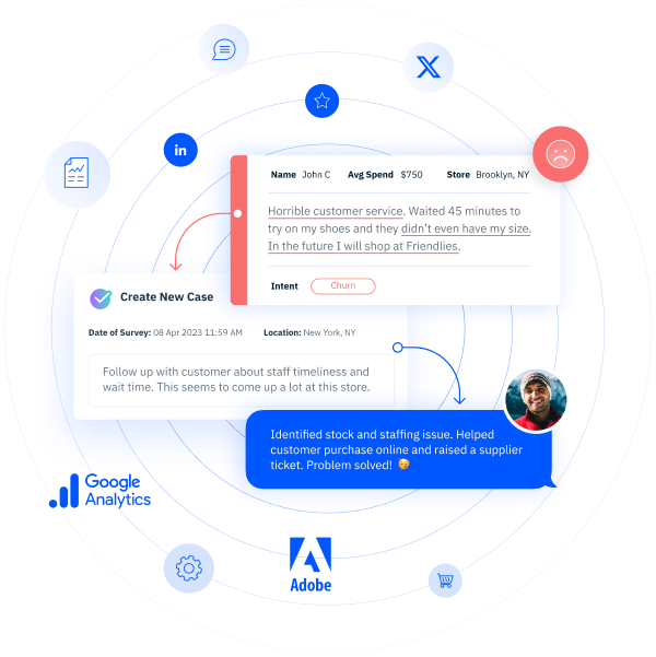
Make sure to also include customer verbatims of common themes. This turns black and white data into a real story with emotion. If a customer posts on your social media about an issue, include it, especially if it shows the pain point’s impact on the customer. Make sure you are showing common trending themes—your CX dashboards should already highlight these to you, so you should not have to go digging each month.
Must-Do #6: Show CX Impact
Finally, it’s great to highlight the wins of the CX team. Include a section of positive initiatives the CX team has taken on to improve the customer experience or even examples of how frontline staff have gone above and beyond to solve a customer issue. This can help bridge the gap between the C-level and the people responsible for your direct customer experience.
At most organizations, the C-suite has probably never stepped foot in their contact center. They often view the contact center as something that has to be there and therefore, they might try to cut costs there as much as possible. To protect this asset, it’s up to you to change the perception of the CEO and highlight how these frontline staff financially contribute to the growth of the company by turning detractors into promoters.
Wrapping Up
The best practice for exec-level CX reports is simplicity. Stick to a one-page, infographic-styled report that showcases key trending metrics with summarised common customer feedback. Speak with your customer success manager to set up dashboards that will have the information ready to go at any time!


