Dashboard and Reporting Techniques to Visually Communicate Complex Data
Editor’s note: This is a chapter from the ebook, Unlock the Value of CX. You can download the entire book here.
In a world in which more and more data is available from a wide variety of channels, many different information sources are being bundled to form the basis for obtaining new and more detailed insights. Effective data visualization gives users a comprehensive overview and the ability to drill down on relevant details, thus supporting evaluation of all information provided. The faster decision-makers are able to recognize opportunities and risks, the better aligned their decisions.
Visually Communicating Complex Data
In essence, data visualization is mapping out data in a way that delivers explanations and exploration possibilities, making it easier for users to “read” and process data-based information. The following design aspects must be addressed to facilitate the reading flow for the user:
• Targeted use of pre-attentive attributes, i.e. characteristics which are perceived and evaluated subconsciously and prior to conscious processing as information
• The organizing of functionalities (e.g. navigation) in learned structures
• Consistent utilization of recurring visualization elements
Visualization Elements for Reporting Systems
The principle of infographics is often drawn upon in developing systemic reporting solutions for visualization aspects, but the limitations of this approach soon become evident. Users not only require flexible and practical usage, which means a high level of accuracy and uncomplicated visualization, but also the following as checklist criteria:
• User-specific detail depth
• Updated data
• Interactivity
The information requirements and selected mode of analysis thus determine the choice of visualization graphics. As a rule, it must be carefully reviewed which chart type is optimally suitable for conveying the desired information. Ideally, a chart should display no more than six values (i.e. elements to be read). The three sample charts below illustrate how this can be accomplished:
1. Structure-creating image elements provide orientation within the content for dependable reading. Additionally, these image elements can themselves be used for navigation, as buttons, for example, opening a Touchpoint Detail Report.
2. Individual values can prominently be visualized using Big Number Boxes. Additional information such as trend versus the preceding month can be integrated via a simple icon.

3. Icons with pre-attentive attributes which have corresponding significance (e.g. smileys, traffic lights, stars) enable color-blind people as well to intuitively process summarized and evaluated data.

The Path to Reporting
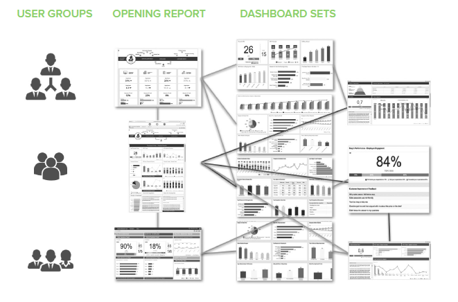
Users today want to see only the information that is relevant to them, enabling more effective and proactive response. This requires a reporting concept for identifying different user types and groups and creating profiles or ‘personas’.
User profiles document differing information needs in terms of content, structure, level of detail and mode of usage and display as well as activation potential, responsibilities, bonus-relevant information elements and scope of action.
At the end of each user profile is a ‘story’ containing the parameters for reporting (i.e. the set of dashboards) specifically configured for the user group.
Proceeding step by step from the starting report, users are shown the information relevant to them and the interrelationships therein. In addition, a dashboard shows possibilities for more in-depth views and further analysis available to the user, providing insights into where action needs to be or could be taken. A well-designed reporting concept integrates advanced analysis capabilities and facilitates interactivity, making it easier to take action based on perceived action relevance.
Comprehensive Overview
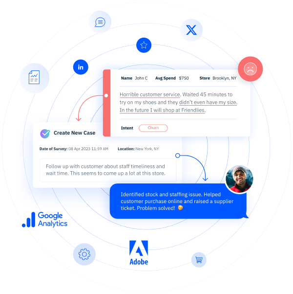
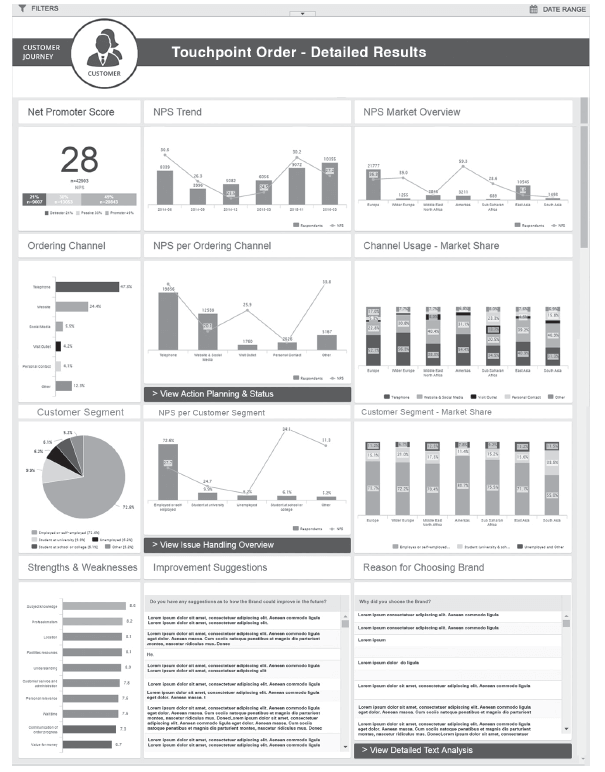
Example: Emilia Schmitz is a brand communication executive. To oversee corporation-wide brand cohesion, she and her team require an overview of the entire array of communication channels and touchpoints. Within the customer lifecycle, her customers have contact with various people and departments within the firm. These contact points can influence how the customer perceives the company and brand in both positive and negative ways. She and her team thus are focused on improving their support for the individual touchpoint managers in providing action plans, ideas and concepts. She requires touchpoint monitoring that ties all of the necessary information together in the background so that she and her team have an overview displayed at all times of the most important KPIs for each touchpoint.
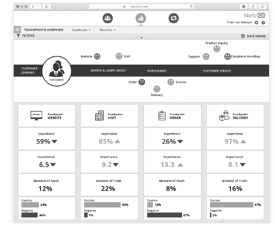
Ms. Schmitz and her team rely on the touchpoint dashboard as an overarching monitoring and leading indicator system. Quick indicators in the header of the dashboard enable her to see immediately where support is most urgently needed.
The dashboard is specifically designed to deliver core information. Only a very limited range of colors are utilized, as the metrics are prominently displayed and partially formatted (red, green etc.), already bundling a lot of information.
Integrated Analytic Capabilities and Easy Interactivity
System users today more than ever insist on the capability to edit data relevant to them. Current online-based solutions meet these needs, providing export functionalities for independent further processing of data.
In addition, modern reporting systems are increasingly being utilized as an analysis tool, having functionalities going beyond the typical, standard filtering options that allow object-based content linking by users.
At the start screen showing information defined as being of the highest priority for the user group, a detailed view of the top level shows the selected NPS® over time and per market, possible ordering channels, the customer groups and strengths and weaknesses in the ordering process, among other things.
Every chart allows interactive drill-down by users. In addition to the usual filter settings, users can drag and drop graphic elements like the “telephone” bar in the ordering channels chart into the report filter. By clicking on the more detailed view for the ordering channel “telephone” the user is navigated to an overview of strengths and weaknesses or the distribution of customer segments for that order channel, for example.
This allows combining different content from the displayed charts in an intuitive, object-based way to create complex filters.
Text Analytics in Touchpoint Monitoring
Text analytic results can also be integrated into touchpoint monitoring, enhancing analysis capability. In addition to keyword search, standard elements for ongoing systematic evaluation of unstructured text are available, including:
• Basic comment sentiment, classified as positive, neutral or negative
• Application of a scheme for comment categorization
The left side of the first text analytics dashboard is focused on overall mood, as indicated by the sentiment and positive or negative evaluations from the top 5 text categories. The second dashboard, on the right, provides a visual view of a specific customer group. An infographic shows the criteria applied for customer segmentation. Sentiment thus reflects a segment-specific value determined by the results of automated text analysis, combined with survey data or CRM data for customer segmentation.
Generating Actionable Information
Modern dashboards and reporting systems have to be usable as a springboard for action, facilitating or suggesting necessary follow-up action steps. There are differing approaches to realizing such capability, such as
• Single sign-on (one-time authentication via central access point to all systems relevant for the user), which allows combined usage of different existing systems
• Processing into a single system, allowing users to switch between various modules at any time
• Custom buttons can be integrated into the respective reports at relevant places which launch action planning or individual case management
Challenges
Comprehensive touchpoint management requires a solid base of data. The very best visualization cannot bring success if relevant information is missing. This means that the necessary data from the various departments and communication channels has to be structured and compiled in an appropriate way.
The Right Data
Most companies utilize dedicated systems, which in many cases are deeply embedded within company structures and provide information to a defined group of users. It is important when creating personas to identify and link to the relevant information sources. Modern software can interface with established enterprise systems via standard formats (Excel, SSPS, etc.) or interfaces (e.g. API for Salesforce) in largely automated fashion. This ensures that users start out with the data relevant and important to them. In addition, all content and information generated on the reporting platform can be exported in standard formats (Excel, CSV, SPSS, PowerPoint or PDF) and processed outside the system and re-imported back into company systems.
Changes at Touchpoints
Digitalization has brought many innovations to the market, especially in the areas of data communication. The shift toward new media and technologies has created additional touchpoints which generate new data streams requiring different modes of analysis and display. The content focus at existing touchpoints is changing as well. The challenge is to promptly recognize such changes and render these measurable and useful for touchpoint management. Systemic solutions must be designed to afford maximum flexibility, allowing rapid integration of new information sources and adaptation of reports to meet the changing information needs or the needs of newly added user groups. The present trend is toward configurable solutions offering on-the-fly calculation affording the flexibility required to quickly compile reports and content, including self-service reporting if desired.
Success Factors
Very few enterprises have comprehensive touchpoint management in place. Intuitive reporting systems are required to ensure transparency regarding risks and opportunities across all touchpoints, but also certain resources must be available as well in order to utilize such systems. Pioneering enterprises that invest in comprehensive touchpoint management will face the upfront challenges outlined above.
There will be few if any overnight success stories to tell, as sustained effort, patience, persistence and perseverance will be critical, along with solid phased implementation planning taking account of both system and personnel resources required. Then as the “low hanging fruit” is harvested, efforts can proceed to plan the next steps and prepare for wider rollout.