Airport Series: Atlanta and Wayfinding
Not only is Hartsfield–Jackson Atlanta International Airport the busiest airport on earth, its "plane train" is the busiest rail system in America. This volume means Atlanta International needs to run with near flawless perfection. In this analysis, we learn exactlty how they can make strides toward that goal.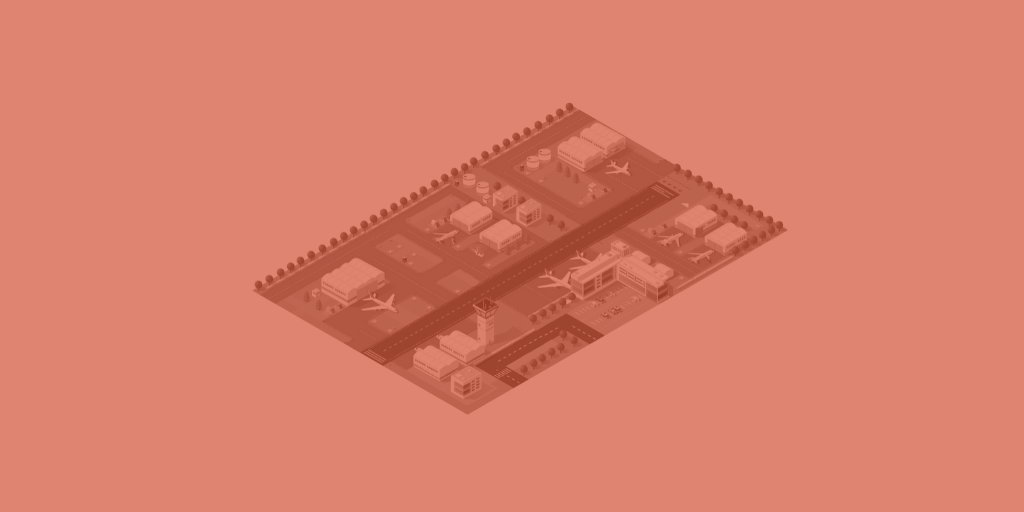
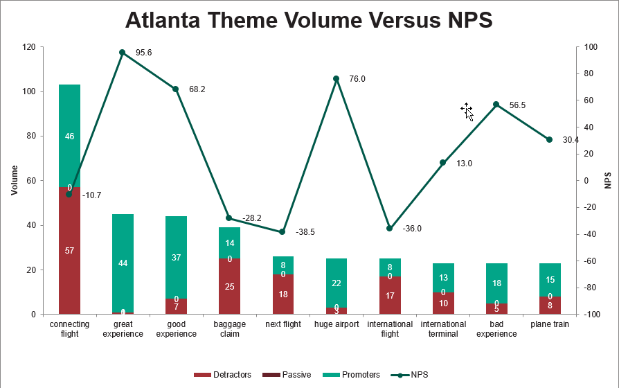
So, here’s the thing: few people are happy when they’re in airports. Whether it’s for business or pleasure, packing everything, checking in, and running to make your flight are all experiences that are generally negative. At least, that’s how I feel when sprinting through indistinguishable terminals looking for my connecting flight – and Atlanta International Airport is no exception.
There are no shortage of listicles and videos online “rating” airports from best to worst. Yet, what does that really mean? Here at InMoment we focus on data and methodology, and Semantria can answer this question by mining Facebook comments, online reviews, and other data from people’s first-hand experiences.
Sentiment analysis for Atlanta International Airport
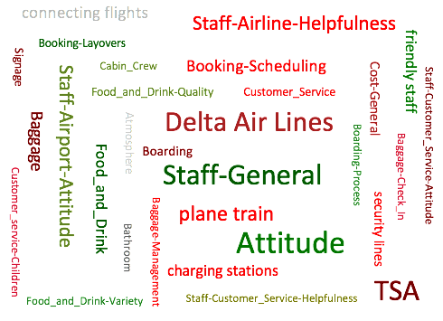
For example, we processed more than 2,759 Facebook reviews for the Atlanta International Airport, clocking in at 5,000 more words than Pride and Prejudice. That’s a lot of reviews, and it allows for very clear themes to emerge. Airport leadership regularly balances budget between marketing and infrastructure, this is where text analytics comes in. Text analytics allows airport leadership to prioritize projects based on customer experience impact. As we’ll find out, often enhancing customer experience requires little overhead. Addressing feedback directly and communicating progress through legacy channels and social media connects customers to the brand by showing them the airport is listening. The product we used for this project is the web based dashboard, Spotlight.
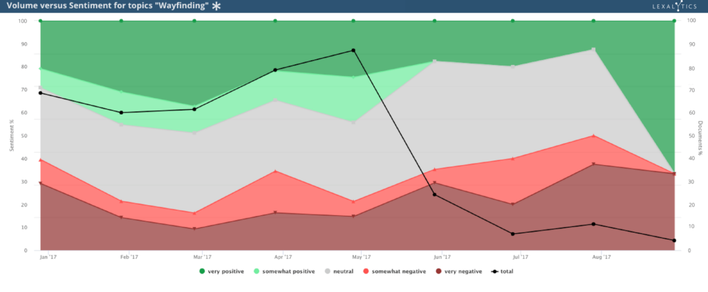
Feedback for Atlanta: Wayfinding
What was the most frequently occurring feedback for Atlanta? Quite simply, wayfinding.“Wayfinding” refers to the way in which people orient themselves in a space to get from one place to the next. At the Atlanta Airport, customers rely on the Air Train to get from the gates to the baggage claim, which can be literally miles away from the gate. So, without clear signage for the train, guests are compelled to walk this distance. Wayfinding related feedback is so vociferous that in over several hundred reviews guests outright advise fliers to avoid Atlanta International Airport entirely. One season traveler shared feedback the following on the ATL Facebook page recently:
“Back when I was traveling a few hundred thousand air miles a year, I avoided this airport like a third world dirt airstrip. Twenty five years later it still has lousy signage, crazy long distances to walk and takes forever to go from point A to point B to say nothing of the crowds.”
When airport architecture is effective, getting from “point A to point B” should be snappy, despite size or crowds. Jim Harding of Gersham Smith & Partners helped design Atlanta’s International Terminal. He asserts that Hartsfield–Jackson is architected with intuitive design in mind:
“We have a set of visual cues that naturally lead and guide you through a big, open space. And it’s a big part of your journey segment… you have lighting that goes up, and over, and down; you have flooring that pulls you in and through. The two come together and point you to the plane that you see through the glass. So this design is very carefully thought out, making that customer experience easy, natural, fluid, intuitive.”
When contrasted next to the true customer experience, which here is represented as natural language data, we can see there’s a chasm between the architect’s intent and how it’s experienced. This is cause for alarm for the airport company, as a lost customer is less likely to have time to engage with third party vendors, impacting precious non-aeronautical revenue.
“It took entirely too long to get to my next gate. There was a mile walk without the train…. With knee problems, pain wasn’t suppose[d] to be a part of my plane ride,” one guest wrote.
Using sentiment analysis we can understand that spaces are too large and confusing. Jim Harding and his team no doubt delivered an admirable design. However, customers still find the spaces at Atlanta cavernous and unstructured enough to be overwhelming. Signage must increase throughout the facility. Customers complain of the less than intuitive design outside as well. Says one reviewer:
“Worst uber/Lyft pickup process ever and terrible signage. I walked alone in a parking lot for an hour before I found it.”
Another, this time a local, confronts one of the airport company’s richest sources of non-aeronautical revenue, parking:
“I’ve been living in Atlanta for 2yrs now. It is a bit confusing. The parking is horrific! Not enough signs for direction and the plane train was definitely anxiety because I didn’t know where the heck it was taking me.”
Saving grace: airport staff
Yet, our analysis also revealed that airport staff can be the saving grace for unhappy customers. One guest pointed out that Delta airline staff were both rude and unhelpful. However, that guest was ultimately helped by an airport maintenance worker to, you guessed it, help find the way to the baggage claim. Another airport employee took a struggling guest to the baggage claim in a wheelchair. Yet another guest described how an airport employee named Timothy not only helped her to the baggage claim, but assisted her in securing a rental car after that company’s employees were “no help.”
Perhaps best of all is an an airport employee who brightens peoples’ spirits while they wait for the bags. As one guest wrote, “I’ve been through this Airport several times. No complaints. I must say I like the man downstairs by baggage claim. Always a song, story and always wanting to give information.” The person-to-person connections travelers make with these employees colors the entire narrative of their experience with the airline and the airport itself.
How Atlanta should act
These are details that stakeholders wouldn’t get from a star-rating or the possibly anecdotal experience of a journalist or reviewer. By simply improving signage and other wayfinding techniques, Atlanta can alleviate myriad pain points on the customer side. On the enterprise side, airport officials can effectively communicate expectations and feedback with their airline tenants, such as Delta and their unhelpful staff. This can build trust between stakeholders and the airlines, and improve the experience for everyone.
All this, just from listening to the customers in a way that allows airports to really hear what they are saying. And best of all? I ran this analysis with no extra tuning in just a couple of minutes, using our Semantria for Excel add-in.
Do more with sentiment analysis
Little experiments like these are some of the fun things we can do with our sentiment analysis tools. Of course, we don’t want to hog all of the fun for ourselves. If you have questions of your own, turn to our website and resources collection. You can plumb the depths of modern text analytics for answers to all sorts of questions, even crazy ones you come up with in the shower. And be sure to get in touch with any specific queries you have!
Until then, check out our next analysis of Charlotte Douglas International!